Merging two products into one
Productsup acquired World of Content with the goal of becoming a single product. I led design for Phase 1 - the shared identity, access model, and visual foundation that every later phase of the merger depended on.
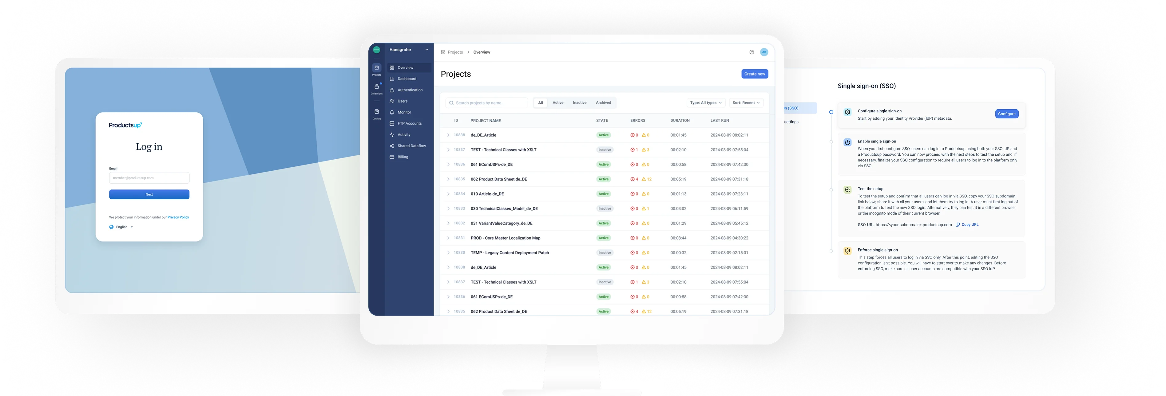
Context
Productsup acquired World of Content to become a single feed-and-content platform. But until the two products actually merged, the company was carrying the cost of running two of everything while customers still faced two disconnected tools. A full merge was too large and too risky to attempt at once, so it got split into phases, and I led the design for the first one.
The first phase focused on creating the foundation for that future integration, without having to merge all functionality immediately. The goal was to make the two products feel like parts of one ecosystem, even though their core functionality still remained separate.
We didn’t merge the platforms’ features yet. We created the foundation that makes the merge possible.
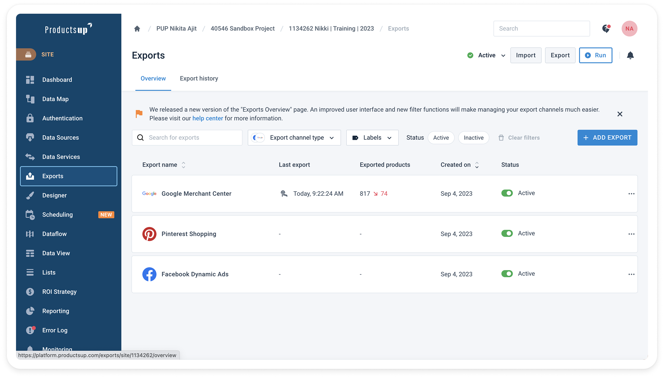
The Productsup interface
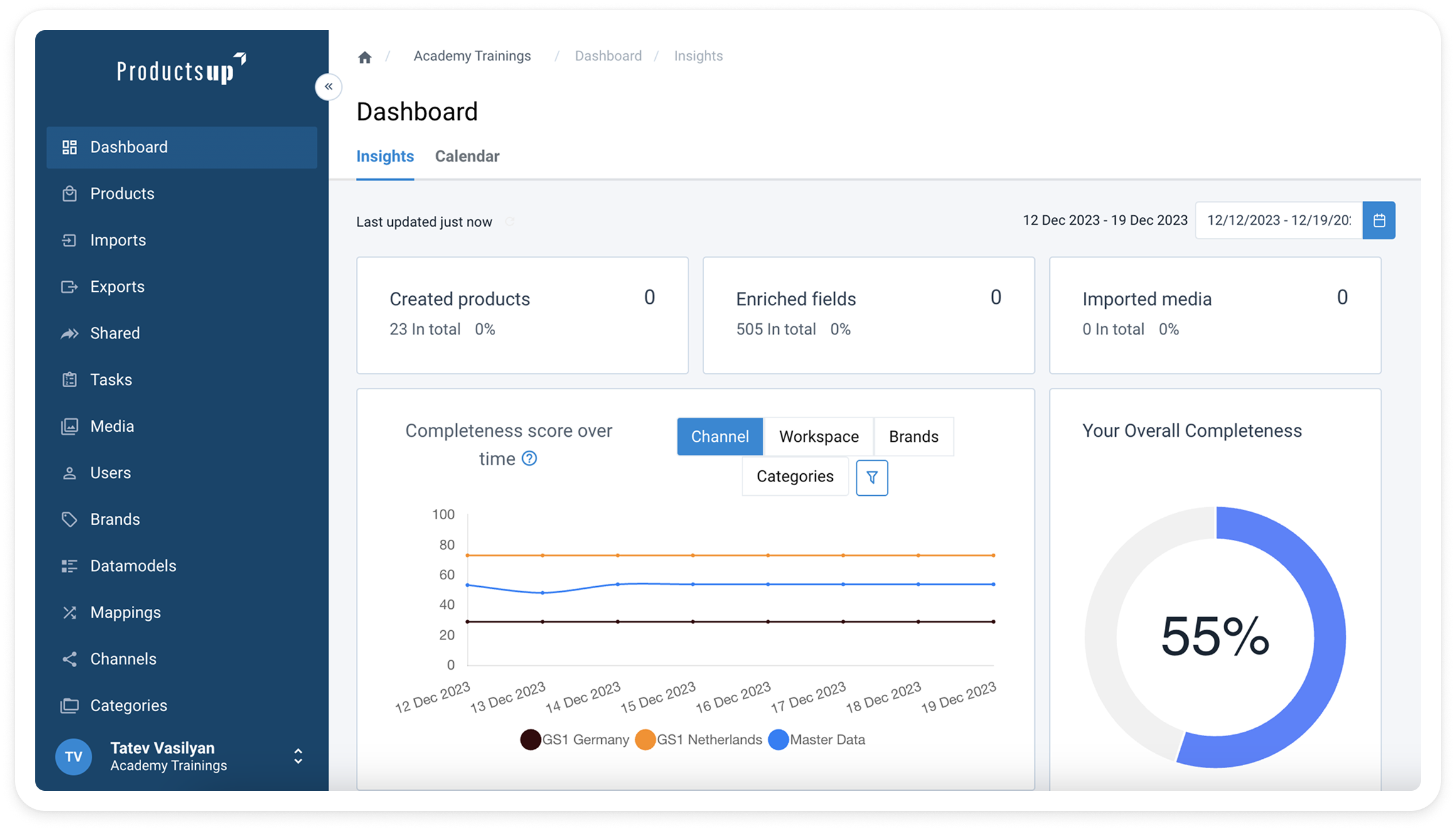
The World of Content interface
There’s one company now, so we named the spaces for the work rather than the corporate history. Projects (formerly Productsup) and Collections (formerly World of Content). Users navigate by what they’re doing, and the users see one product, not two stitched together
What I delivered
Over 3 months, I helped transform Productsup from two separate platforms into a connected product ecosystem with shared access, unified user management, and a consolidated design system
One shared entry point
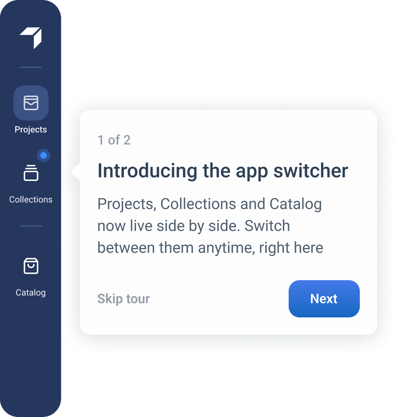
A World of Content user could step into Productsup and vice versa, without a second login or a second identity. The switcher to move between the two spaces is shown only to the users who have access to both
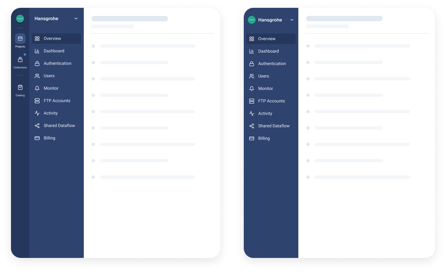
Dual access and Single access: with and without app switcher
Unified user management
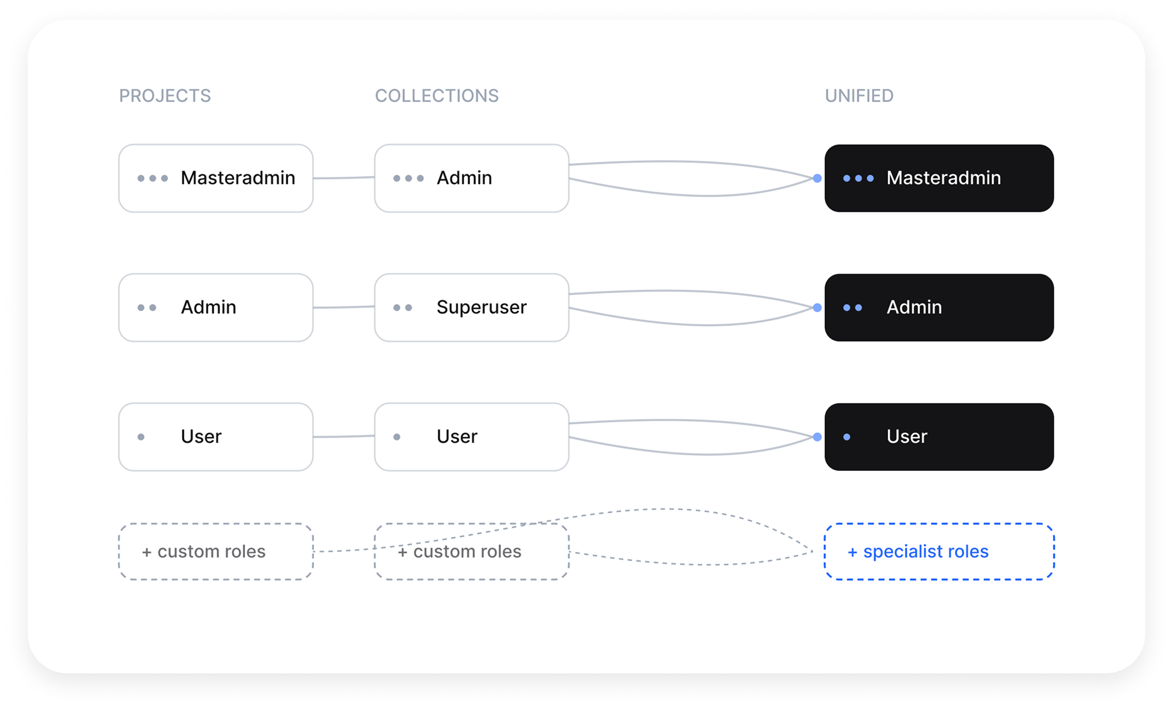
One model for roles and permissions across platforms that had defined them in completely different ways, including the custom, specialist roles each product carried.
Consolidated design system
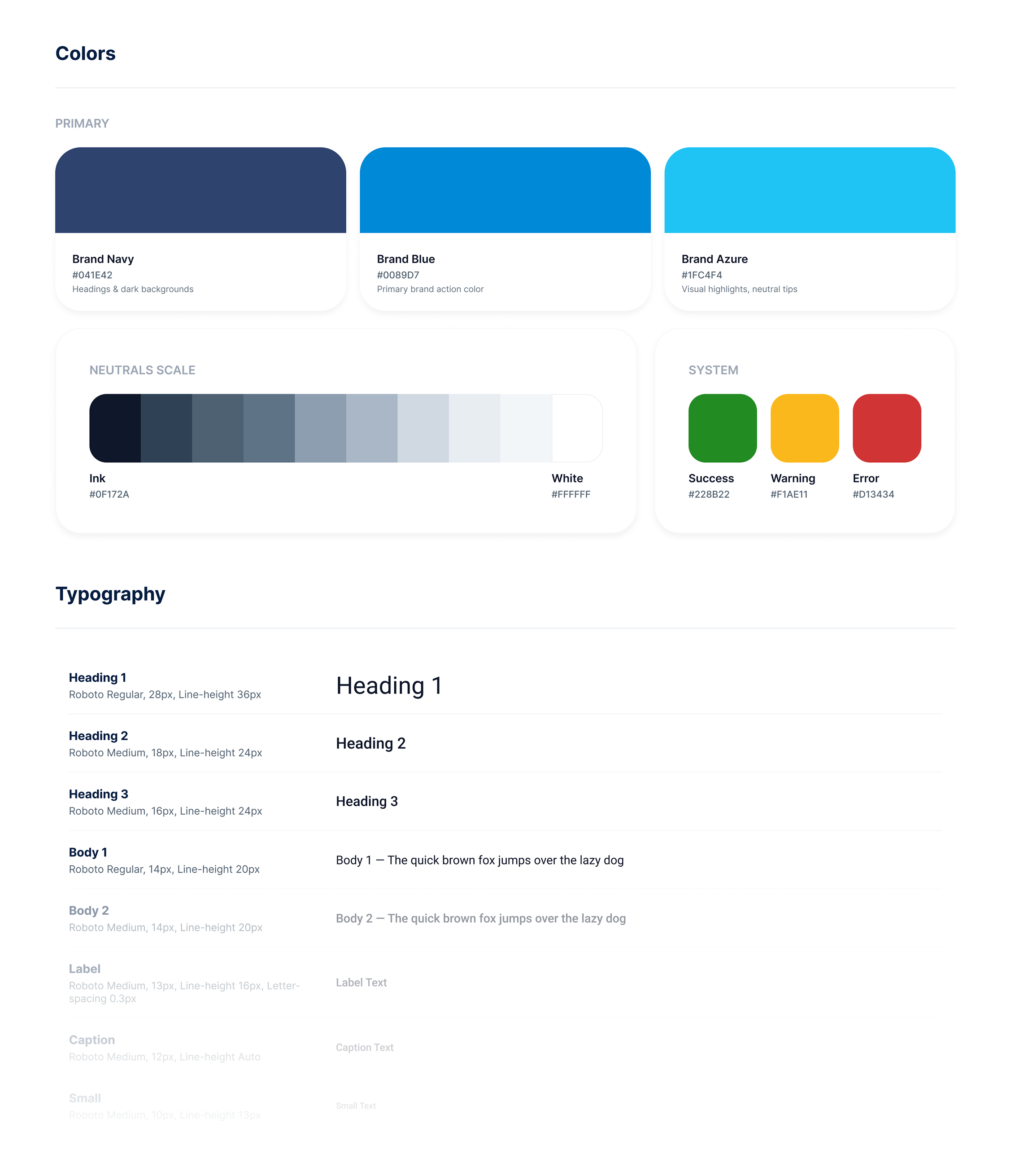
One design language across both spaces, so moving between them feels continuous, also reduced ongoing design and engineering duplication
One consolidated design system
Guided onboarding tooltips
In-product tooltips to walk users through what had changed — the platform’s first guided onboarding of its kind, and a pattern the team could reuse for future changes.
Guided onboarding tooltips
How I approached it
I treated this as two problems running in parallel: who the users are and how access should work, and what the merged experience should look and feel like. The first was mostly research and systems thinking. The second was interface design.
Track 1
Understand two sets of users, reconcile two role structures, and map where the products overlap.
Track 2
Design a single entry point and a design system that lets people cross between products without friction.
Defining the proto personas
Understanding the users of both products
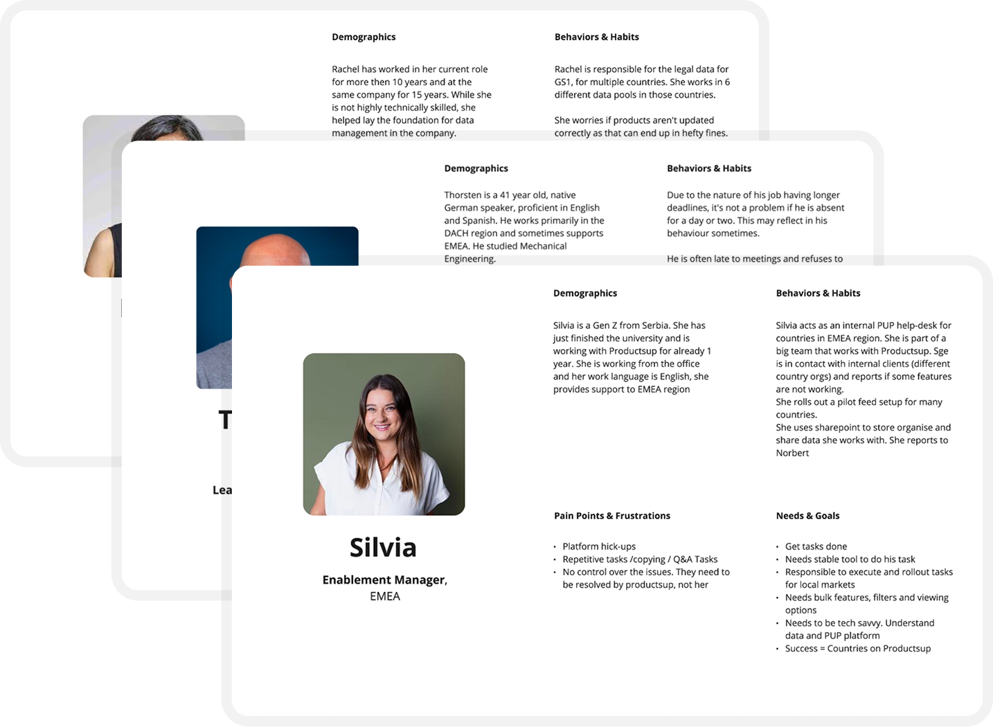
A 3-hour workshop with internal users produced 14 proto-personas. Because the two products had different histories, their users held different mental models, this is where that gap became visible.
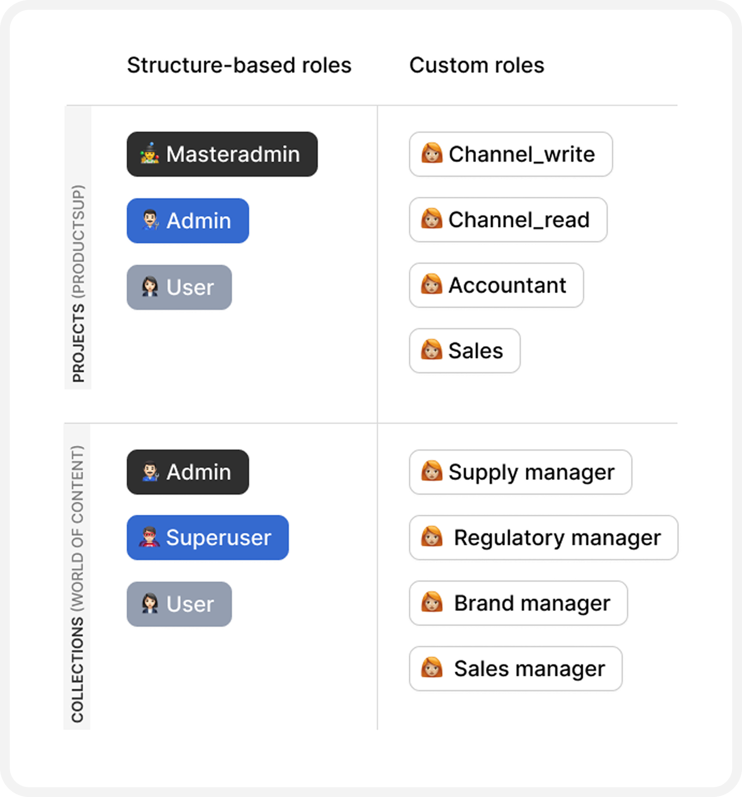
User roles for each app
Mapping roles with engineering
Each platform had its own role structure. Working with the engineering team, I mapped how those roles related, e.g. where a Productsup admin matched a World of Content one.
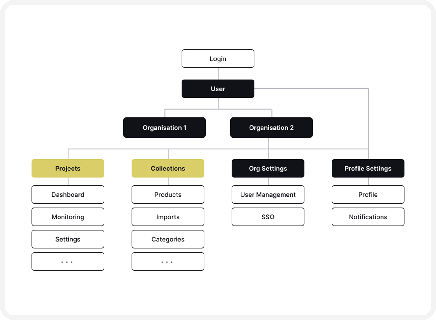
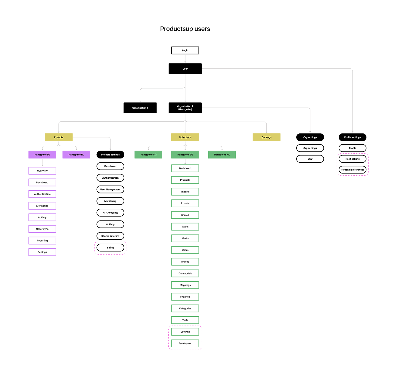
Sitemaps per role for each app
Finding the overlaps in the two apps
I built a sitemap of both products and sat down with the tech leads to map the touchpoints - where the flows overlapped, where they were unique, and where the same idea was named or structured differently. This became a reference artifact the later phases kept coming back to.
The process
↓ Discovery
✽ 3-hour workshop → Proto Personas
✽ Audited roles & permissions per platform
↓ Define
✽ Information architecture of both apps
✽ Sitemap for each role on what they have access to in the new unified application
↓ Develop
✽ Wireframes
✽ Unmoderated usability test to validate the final wireframes at scale
✽ Unifying the design systems of both
↓ Deliver
✽ Launched the new application
Design artefacts
A glimpse of some of the design-thinking activities I ran to uncover answers and inform product vision — from defining personas to co-creation workshops, usability tests, and more.
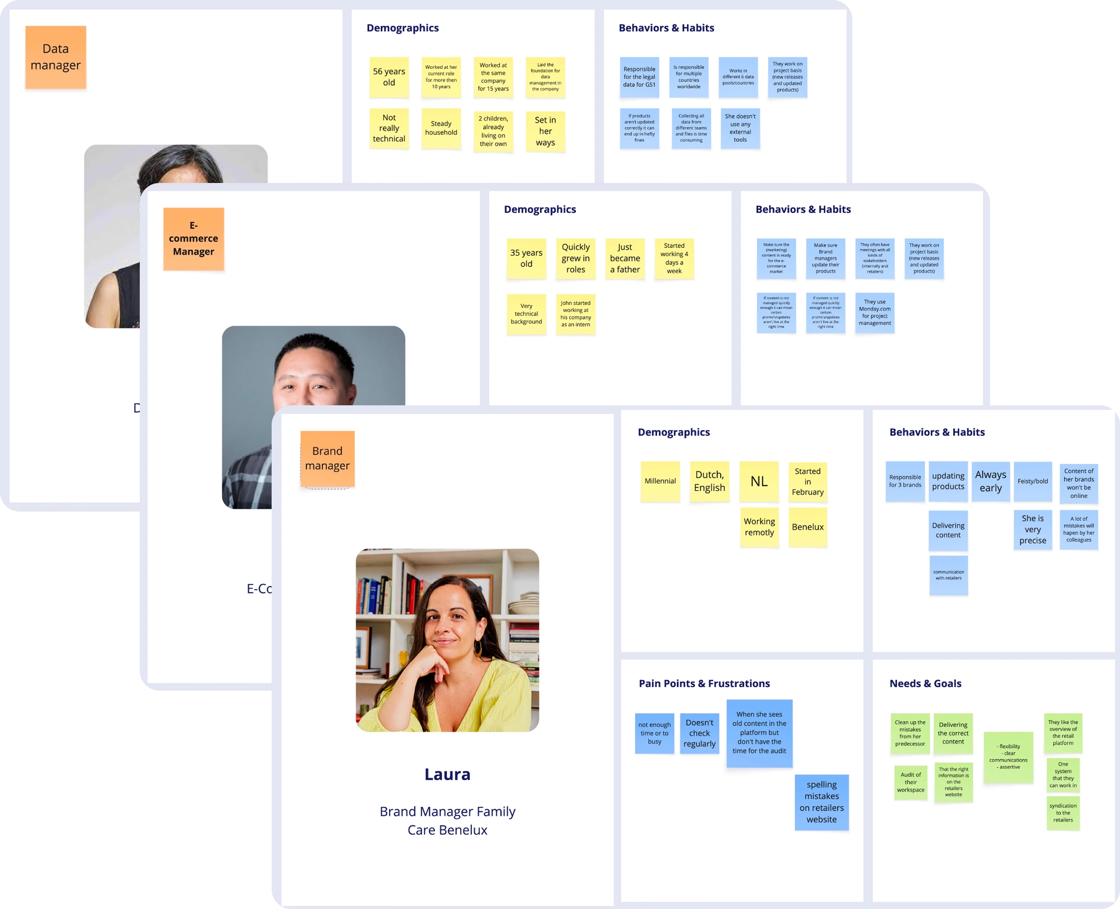
14 proto personas defined from a 3-hour workshop with internal users
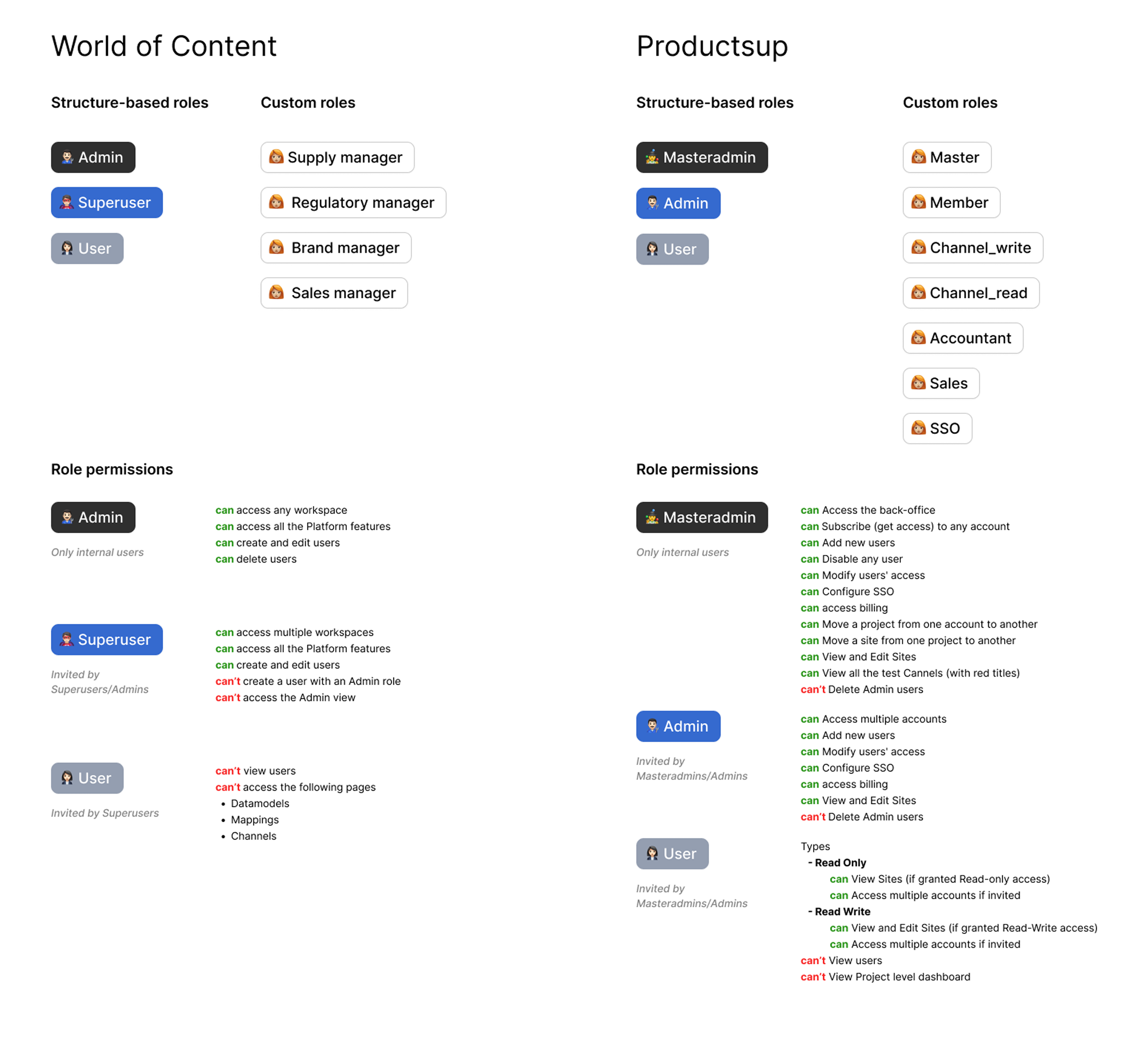
User roles and permissions for each app
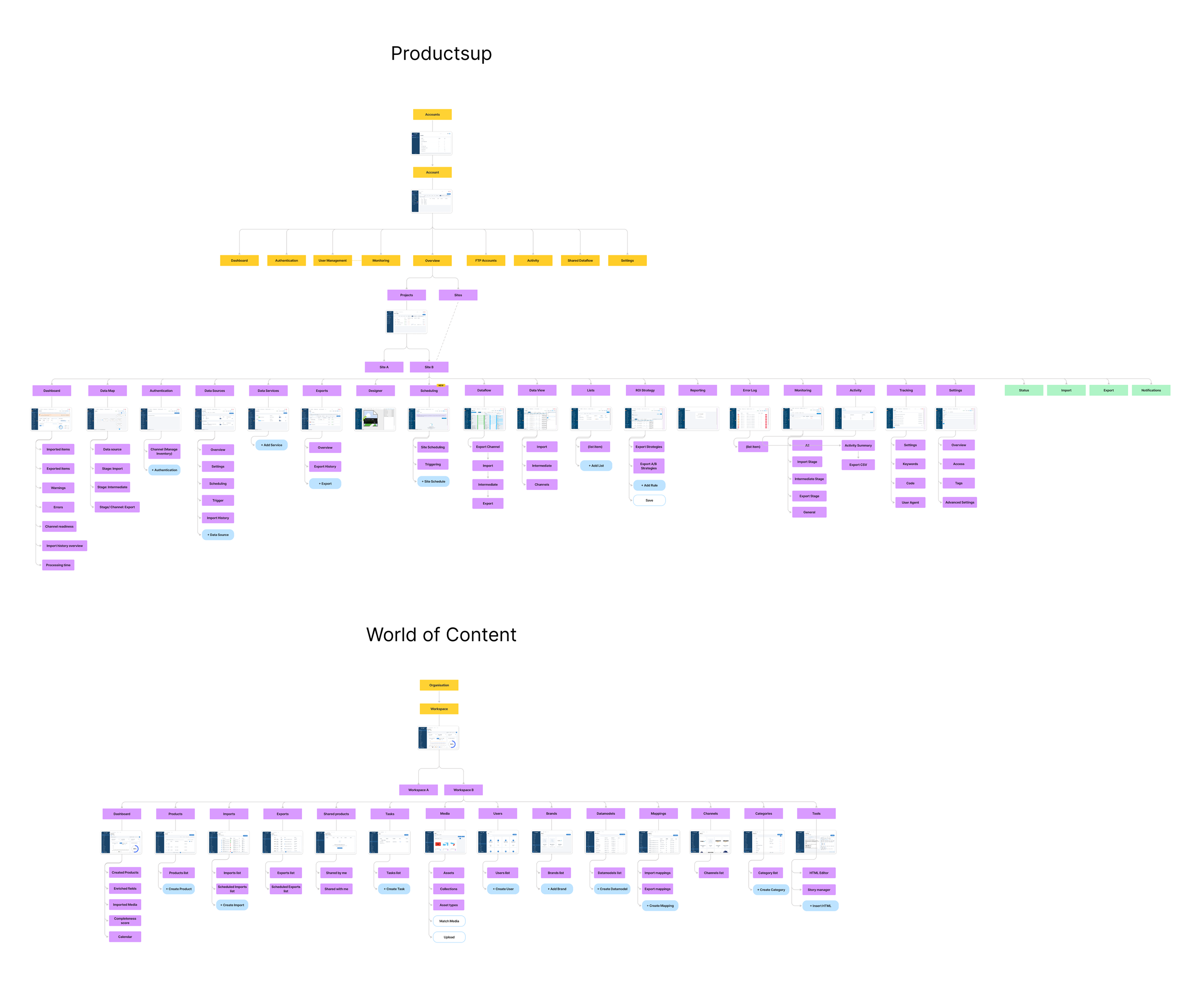
Information architecture for both apps
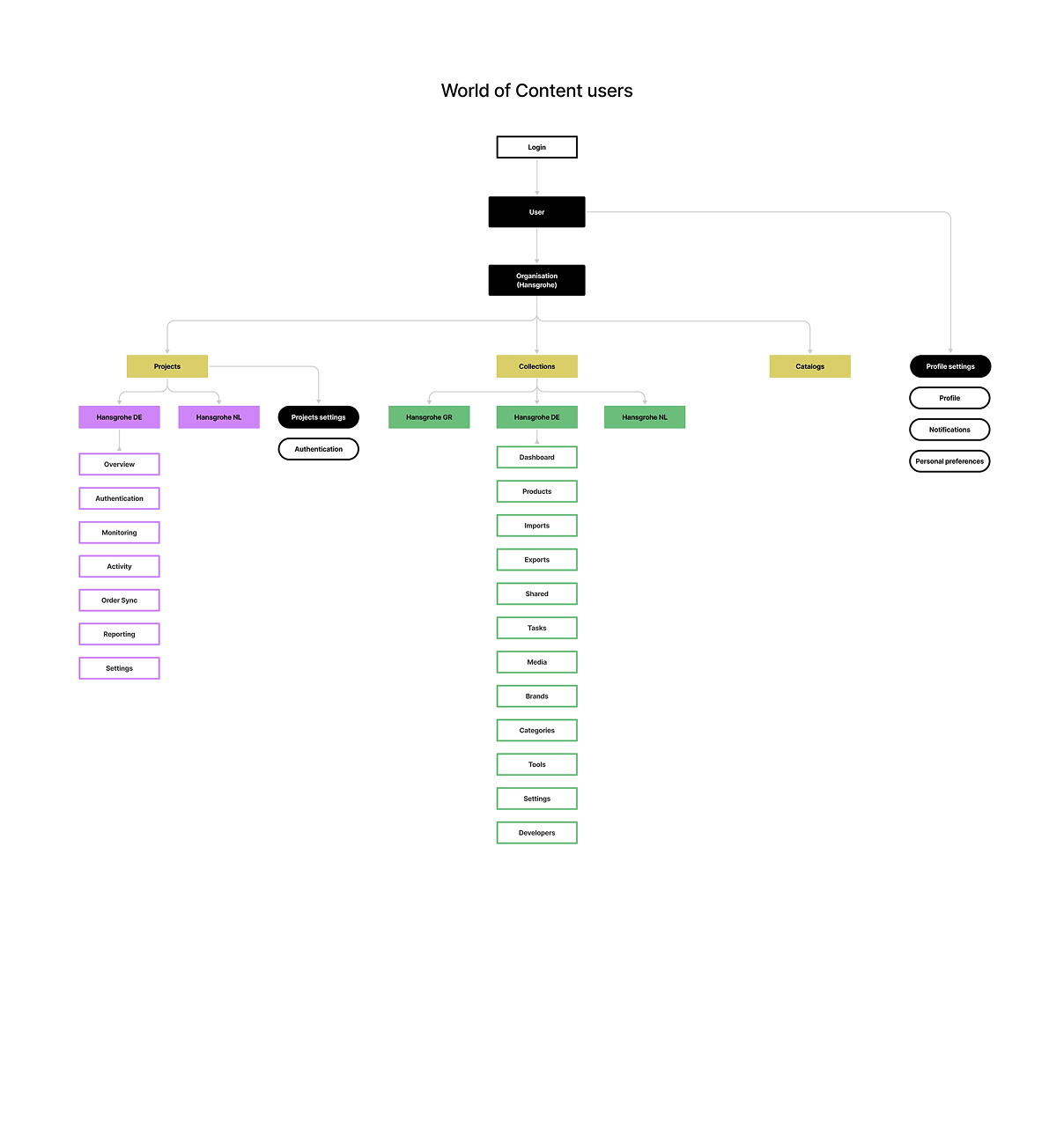
Sitemap for the unified app users based on their roles
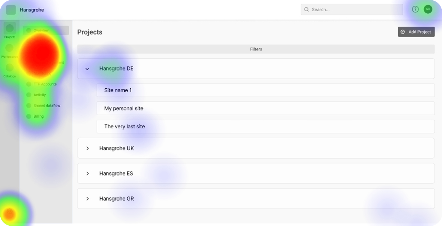
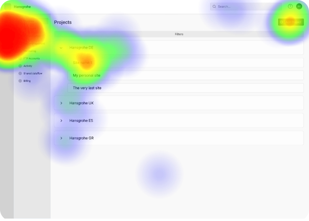
Unmoderated usability tests with 13 participants to validate the new navigation
The challenges and the trade-offs
One shell that adapts to access
The unified app had to serve two populations - users with access to both spaces, and users with access to only one. I merged the organization levels into one architecture where the only element that changes between user types is the app switcher: present for people who can reach both Projects and Collections, absent for everyone else. One shell, one variable.
Roles that didn’t map one-to-one
Each platform had three main roles that lined up reasonably well, but both also carried custom roles for specialists, like an accountant who needs the billing section without being an admin. A clean three-role mapping would have forced a choice between locking those specialists out or over-granting them admin access. A usability problem on one side, a security problem on the other.
A neutral home for merged settings
Profile settings had to be one surface both apps could reach — but putting it inside either app would have tied it to that app’s structure and that team’s ownership. Since two apps and two dev teams needed equal access, settings became a standalone surface, independent of both. A small screen with an outsized constraint: where it lived was a question of ownership and access as much as user flow.
Two org levels, only one with settings
Both apps had an organization level, but only Projects exposed organization settings. Collections had none. So merging meant introducing those settings to users who’d never seen them, without disrupting the ones who relied on them. We unified on the more complete model and made the inherited settings legible to the side gaining them.
What I would do differently
Which space opens first
When someone with access to both spaces logs out and back in, one of them has to open first — Projects or Collections. I settled this mostly with engineering, weighing whether persisting the last-used space was worth the cost of remembering it. Right group for the technical trade-off, but it’s a user-facing default, and I made it without users. I’d test the options - last space used vs. a fixed default with people who actually work across both products before committing.
Pull in support and customer success earlier
I’d pull support and customer success in earlier. They knew exactly where dual-account users got stuck, which was information I was partly guessing at. Bringing them in sooner would have sharpened the model from the start.